Suncel home page Suncel v1.1
Suncel v1.1- Custom schema
Blocks > Custom schema
Custom block schema
On top of the provided block schema, you can also create a custom schema to edit the block properties with your own logic.
The setting component associated with the schema is just a react component.
Setting component
It is just a simple react component, it will receive all the properties from the schema, with two additional properties to manage the editing.
value: The current value of the propertyonChange: To edit the value of the property
Example
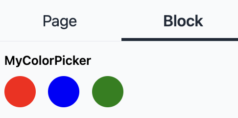
This is a simple color picker with 3 colors. The selected color is highlighted with a black border.
import React from "react";
import { SettingsComponentProps } from "@suncel/nextjs/admin";
import clsx from "clsx";

const colorsArray = ["red", "blue", "green"];

export const CustomSettingsComp: React.FC<SettingsComponentProps<valueType = any>> = ({ value, onChange }) => {

  return (
    <div className='flex flex-row space-x-4'>
      {colorsArray.map((color, key) => {
        return (
          <div
            key={key}
            className={clsx(`h-10 w-10 rounded-full duration-300 cursor-pointer`, {
              "border-2 border-gray-800 scale-125": value === color,
            })}
            onClick={() => onChange(color)}
            style={{ background: color }}
          />
        );
      })}
    </div>
  );
};
Register the custom schema
The custom schema needs to be registered in the settingsComponents attribute of the SuncelAdmin component.
interface SettingsComponent {
  type: string; // The type that will be use in block schema
  component: (props: SettingsComponentProps) => JSX.Element; // The setting component
}
Example
const AdminPage: NextPage = () => {
  return (
    <SuncelAdmin
      settingsComponents={[
        {
          type: "MyColorPicker",
          component: (props) => {
            return <CustomSettingsComp {...props} />;
          },
        },
      ]}
    />
  );
};
Use it in a Block
CustomField type
type CustomField = {
	type: 'custom'
    customType: string; // the type defined in the SuncelAdmin component
	name: string
	slug: string // The name of the prop from the component
	defaultValue?: string | number | defaultValueFunc<string> //Default value, can be a function
	disabled?: boolean // To disabled the field , default true
	displayInSettings?: boolean //To display in the editor settings panel, default true
}
Example:
interface MyComponentProps {
  slug: string;
}

export const MyComponent: SuncelBlock<MyComponentProps> = ({ slug }) => {
 ...
};

MyComponent.suncel = {
...
  editor: {
    settings: [
      {
        type: "custom",
        customType: "MyColorPicker",
        slug: "slug",
        name: "MyColorPicker",
      },
    ],
  },
};