 Suncel v1.1
- Schema
Blocks > Schema
Block Schema
Understanding the utility of Block schema
What is a Block Schema
A schema is required for a Block as it will be used to identify the Block in the page builder. It also brings valuable options.
It can define the default values of the Block and add a set of options to edit its props through the settings panel in the page builder.
Add a schema
To add a schema to your Block, use the object Suncel from your component.
BlockName.suncel = {
  ....
}
Schema type
type SuncelBlockConfig<T> = {
  displayName: string;
  slug: string;
  defaultProps: Partial<T>;
  editor: { settings: SuncelField[] };
  query?: (props: {
  pageProps: Partial<IPageProps>;
  blockProps: any;
}) => Promise<Record<string, any>>;
};
slug: unique block identifier. Each block must have a different slug !
displayName:
Blockname. It is the name displayed when a user selects aBlockin the editor
defaultProps: default values of the
Blockpropseditor:
settings: Used to edit the
Blockprops. The settings will appear on the settings panel (right panel) in the page builder
query: Server side fetch. Has the pageProps and Blocks props as parameters. The return will overrides Blocks props. For query function to word you need to give the context config to the GetSuncelStaticProps function
Define Block default values
You can define the default values of a Block , inside the property defaultProps of the schema.
import React from 'react'
import { SuncelBlock } from '@suncel/nextjs'

type BlockNameProps = { text: string }

export const BlockName: SuncelBlock<BlockNameProps> = ({ text }) => {
	...
}

BlockName.suncel = {
    defaultProps: {
        text: 'My amazing text'
    },
...
}
Block settings
Settings are used to interact with the Block props of the page builder via the settings panel (right bar of the page builder).
Settings elements are an array of SuncelField
type SuncelField =
  | CustomField
  | KeyField
  | TextField
  | NumberField
  | TextareaField
  | CheckboxField
  | LinkField
  | PageField
  | DateField
  | GroupField
  | RadioField
  | RangeField
  | ColorField
  | RichTextField
  | SelectField
  | ImageField
  | RepeatableField
  | ObjectField;
When using slug, be careful to put the exact same name as the props name in the exact path order. To access a nested property, add . between each slug of the path.
Example of a Property and its corresponding slugs :
type Props = {
	label: string      // slug: 'label'
	person: {         // slug: 'person'
		name: string,    // slug: 'person.name'
		address: {      // slug: 'person.address'
			street: string // slug: 'person.address.street'
		}
	}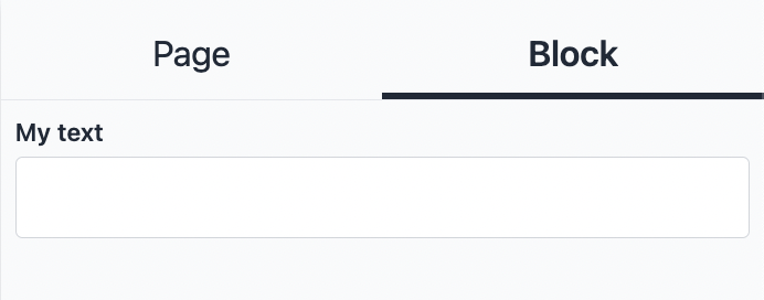
}TextField
TextField edits props of type string.
Type:
type TextField = {
	type: 'text'
	name: string
	slug: string // The name of the prop from the component
	defaultValue?: string | defaultValueFunc<string> //Default value, can be a async function
	disabled?: boolean // To disabled the field , default false
	displayInSettings?: boolean // To display in the editor settings panel, default true
}Example:
interface MyComponentProps {
  slug: string;
}

export const MyComponent: SuncelBlock<MyComponentProps> = () => {
    ...
};

MyComponent.suncel = {
  ...
  editor: {
    settings: [
      {
        type: "text",
        slug: "slug",
        name: "My text",
      },
    ],
  },
  ...
};
Admin page builder setting view:
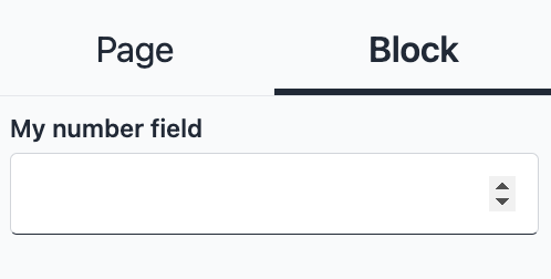
NumberField
Number field edits props of type number
Type:
type NumberField = {
	type: 'number'
	name: string
	slug: string // The name of the prop from the component
	defaultValue?: string | number | defaultValueFunc<string> //Default value, can be a async function
	disabled?: boolean // To disabled the field , default true
	displayInSettings?: boolean //To display in the editor settings panel, default true
}Example:
interface MyComponentProps {
  slug: number;
}

export const MyComponent: SuncelBlock<MyComponentProps> = () => {
  ...
};

MyComponent.suncel = {
  ...
  editor: {
    settings: [
      {
        type: "number",
        slug: "slug",
        name: "My number field",
      },
    ],
  },
};
Admin page builder setting view:
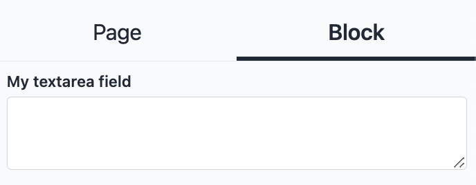
TextAreaField
TextArea field edits props of type string
Type:
type TextareaField = {
	type: 'textarea'
	name: string
	slug: string // The name of the prop from the component
	defaultValue?: string | defaultValueFunc<string> //Default value, can be a async function
	disabled?: boolean // To disabled the field , default true
	displayInSettings?: boolean //To display in the editor settings panel, default true
}
Example:
interface MyComponentProps {
  slug: string;
}

export const MyComponent: SuncelBlock<MyComponentProps> = () => {
  ...
};

MyComponent.suncel = {
  ...
  editor: {
    settings: [
      {
        type: "textarea",
        slug: "slug",
        name: "My textArea field",
      },
    ],
  },
};
Admin page builder setting view:
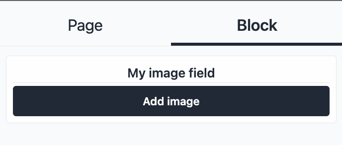
ImageField
Image field edits props of type ImageType
Type:
type ImageType = {
  src?: string;
  alt?: string;
};

type ImageField = {
	type: 'image'
	name: string
	slug: string // The name of the prop from the component
	defaultValue?: ImageType | defaultValueFunc<ImageType> //Default value, can be a async function
	displayInSettings?: boolean //To display in the editor settings panel, default true

}
Example:
import { SuncelBlock, ImageType } from "@suncel/nextjs"

interface MyComponentProps {
  slug: ImageType;
}

export const MyComponent: SuncelBlock<MyComponentProps> = () => {
  ...
};

MyComponent.suncel = {
  ...
  editor: {
    settings: [
      {
        type: "image",
        slug: "slug",
        name: "My image field",
      },
    ],
  },
};
Admin page builder setting view:
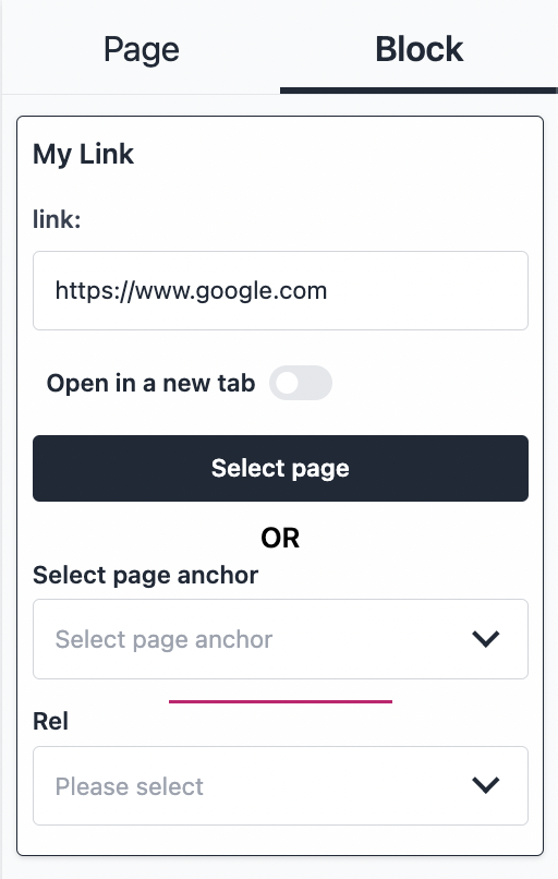
LinkField
Checkbox field edits props of type LinkType
Type:
type LinkRelType = "nofollow" | "search" | "alternate" | "author" | "bookmark" | "external" | "help" | "license" | "next" | "noopener" | "noreferrer" | "opener" | "prev" | "tag

type LinkType = {
  target?: '_blank' | '_self' | '_parent' | '_top' | 'framename';
  rel?: LinkRelType[] | LinkRelType;
  href?: string;
};

type LinkField = {
	type: 'link'
	name: string
	slug: string // The name of the prop from the component
	defaultValue?: LinkType | defaultValueFunc<LinkType> //Default value, can be a async function
	displayInSettings?: boolean //To display in the editor settings panel, default true
}
Example:
import { SuncelBlock, LinkType } from "@suncel/nextjs";

interface MyComponentProps {
  slug: LinkType;
}

export const MyComponent: SuncelBlock<MyComponentProps> = () => {
  ...
};

MyComponent.suncel = {
  ...
  editor: {
    settings: [
      {
        type: "link",
        slug: "slug",
        name: "My Link",
        // optional default value
        defaultValue: {
          href: "https://www.google.com",
        },
      },
    ],
  },
};
Admin page builder setting view:
PageField
Page field edits props of type Partial<Page>. For the page content to be automatically updated you need to give the context config to the GetSuncelStaticProps function.
Type:
type PageField = {
	type: 'page'
	fields:   fields?: (keyof Exclude<Page, 'saved_content' | 'history' | 'contents'>)[];
}
Example:
interface MyComponentProps {
slug: Partial<Page>;
}
export const MyComponent: SuncelBlock<MyComponentProps> = () => {
...
};
MyComponent.suncel = {
...
editor: {
settings: [
{
type: "page",
name: "Post",
slug: "",
fields: ["_id", "path", "properties", "published_date"],
},
],
},
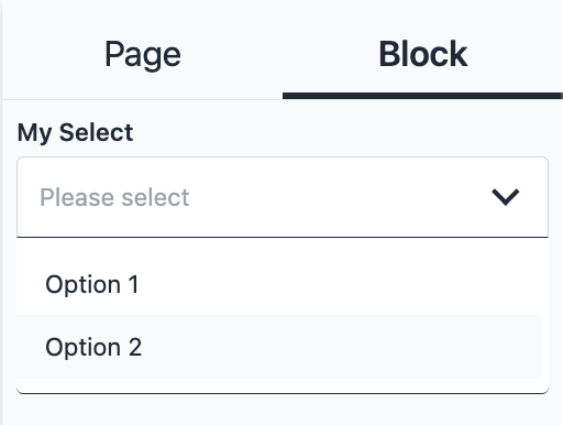
};SelectField
Select field edits props of type string | string[]
Type:
type Option = {
  name: string;
  value: string;
};

type SelectField = {
	type: 'select'
	name: string
	slug: string // The name of the prop from the component
	multi?: boolean; // To multi select
	options: Option[] | defaultValueFunc<Option[]>; // Options of the select, can a function
	asyncOptions?: asyncDefaultValueFunc<Option[]>; // Options of the select, if async function needed
	defaultValue?: string | defaultValueFunc<string> //Default value, can be a async function
	displayInSettings?: boolean //To display in the editor settings panel, default true
Example:
interface MyComponentProps {
  slug: string;
}

export const MyComponent: SuncelBlock<MyComponentProps> = () => {
  ...
};

MyComponent.suncel = {
 ...
  editor: {
    settings: [
      {
        type: "select",
        slug: "slug",
        name: "My Select",
        options: [
          {
            value: "option_1",
            name: "Option 1",
          },
          {
            value: "option_2",
            name: "Option 2",
          },
        ],
      },
    ],
  },
};
Admin page builder setting view:
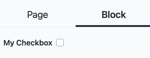
CheckBoxField
Checkbox field edits props of type Boolean
Type:
type CheckboxField = {
	type: 'checkbox'
	name: string
	slug: string // The name of the prop from the component
	defaultValue?: boolean | defaultValueFunc<boolean> //Default value, can be a async function
	displayInSettings?: boolean //To display in the editor settings panel, default true
}
Example:
import { SuncelBlock } from "@suncel/nextjs";

interface MyComponentProps {
  slug: boolean;
}

export const MyComponent: SuncelBlock<MyComponentProps> = () => {
  ...
};

MyComponent.suncel = {
  ...
  editor: {
    settings: [
      {
        type: "checkbox",
        slug: "slug",
        name: "My Checkbox",
      },
    ],
  },
};
Admin page builder setting view:
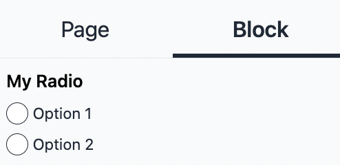
RadioField
Radio field edits props of type Boolean
Type:
type Option = {
  name: string;
  value: string;
};

type RadioField = {
	type: 'radio'
	name: string
	slug: string // The name of the prop from the component
	options: Option[] | defaultValueFunc<Option[]>; // Options of the select, can a function
	asyncOptions?: asyncDefaultValueFunc<Option[]>; // Options of the select, if async function needed
	defaultValue?: string | defaultValueFunc<string> //Default value, can be a async function
	displayInSettings?: boolean //To display in the editor settings panel, default true
}
Example:
interface MyComponentProps {
  slug: string;
}

export const MyComponent: SuncelBlock<MyComponentProps> = () => {
  ...
};

MyComponent.suncel = {
...
  editor: {
    settings: [
      {
        type: "radio",
        slug: "slug",
        name: "My Radio",
        options: [
          {
            value: "option_1",
            name: "Option 1",
          },
          {
            value: "option_2",
            name: "Option 2",
          },
        ],
      },
    ],
  },
};
Admin page builder setting view:
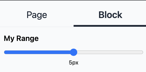
RangeField
Range field edits props of type number
Type:
type RangeField = {
  type: 'range';
  name: string
  slug: string // The name of the prop from the component
  min?: number; // Start value of the range
  max?: number; // End value of the range
  step?: number; // The step between each value
  unit?: string;
  disabled?: boolean // To disabled the field , default true
  displayInSettings?: boolean //To display in the editor settings panel, default true
}
Example:
import { SuncelBlock } from "@suncel/nextjs";

interface MyComponentProps {
  slug: number;
}

export const MyComponent: SuncelBlock<MyComponentProps> = ( ) => {
...
};

MyComponent.suncel = {
...
  editor: {
    settings: [
      {
        type: "range",
        slug: "slug",
        name: "My Range",
        max: 10,
        unit: "px",
      },
    ],
  },
};
Admin page builder setting view:
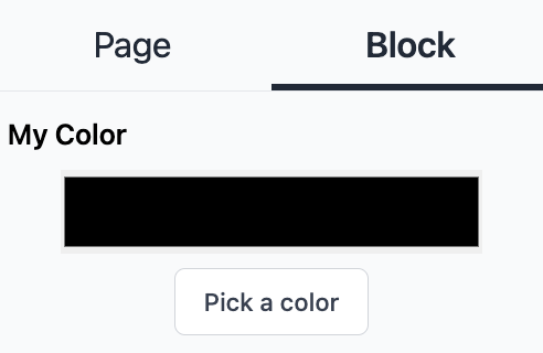
ColorField
Color field edits props of type string. It return the hexa color code
Type:
type ColorField = {
	type: 'color'
	name: string
	slug: string // The name of the prop from the component
	defaultValue?: string | defaultValueFunc<string> //Default value, can be a async function
	disabled?: boolean // To disabled the field , default true
	displayInSettings?: boolean //To display in the editor settings panel, default true
}
Example:
import { SuncelBlock } from "@suncel/nextjs";

interface MyComponentProps {
  slug: string;
}

export const MyComponent: SuncelBlock<MyComponentProps> = ( ) => {
...
};

MyComponent.suncel = {
...
  editor: {
    settings: [
      {
        type: "color",
        slug: "slug",
        name: "My Color",
      },
    ],
  },
};
Admin page builder setting view:
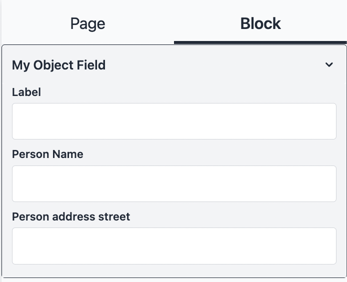
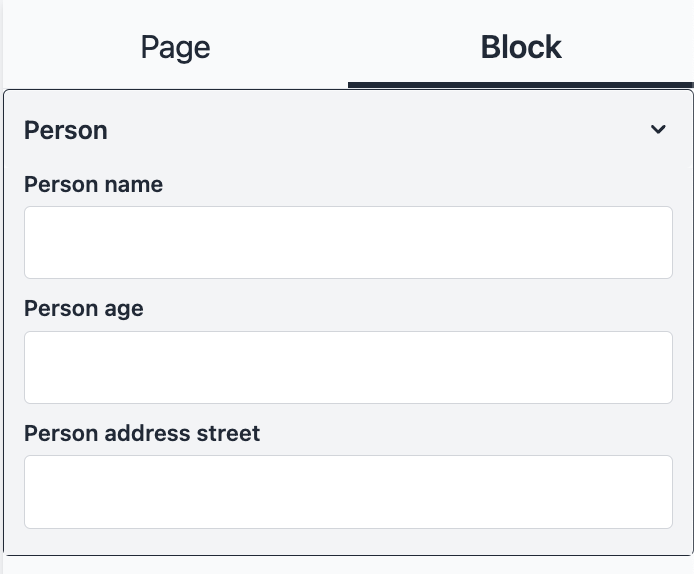
ObjectField
Object field edits props of type object.
ObjectField will create an accordion with the fields inside.
When using slug inside ObjectField fields, it will take the ObjectField slug as root. Please look at the example
Type:
type ObjectField = {
	type: 'object'
	name: string
	slug: string // the name of the prop from the component
	fields: SuncelField[]; // List of field, fields that the object contain
	defaultValue?: any[];
	displayInSettings?: boolean;
}
Example:
interface MyComponentProps {
	objectField: {
		label: string
		person: {
			name: string,
			address: {
				street: string
			}
		}
	}
}

export const MyComponent: SuncelBlock<MyComponentProps> = () => {
...
};

MyComponent.suncel = {
...
  editor: {
    settings: [
      {
        type: "object",
        slug: "objectField", // Slug of the object
        name: "My object field",
        fields: [
          {
            type: "text",
            slug: "label", // Root slug is objectField so objectField is skiped
            name: "Label",
          },
          {
            type: "text",
            slug: "person.name", // Root slug is objectField so objectField is skip
            name: "Person Name",
          },
          {
            type: "text",
            slug: "person.address.street", // Root slug is objectField so objectField is skip
            name: "Person address street",
          },
        ],
      },
    ],
  },
};
Admin page builder setting view:
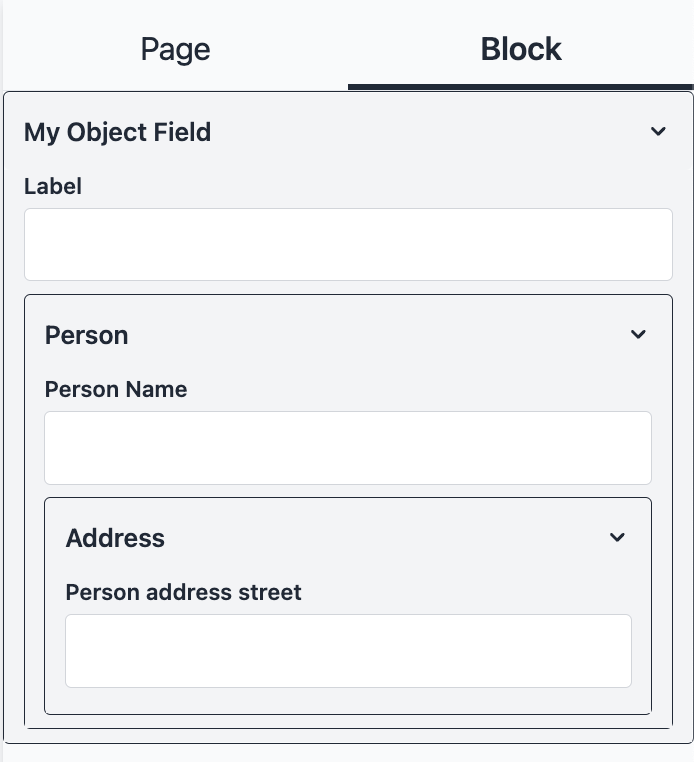
Example 2:
interface MyComponentProps {
  objectField: {
    label: string;
    person: {
      name: string;
      address: {
        street: string;
      };
    };
  };
}

export const MyComponent: SuncelBlock<MyComponentProps> = () => {
 ...
};

MyComponent.suncel = {
...
  editor: {
    settings: [
      {
        type: "object",
        slug: "objectField",
        name: "My object field",
        fields: [
          {
            type: "text",
            slug: "label", // Root slug is objectField so objectField is skip
            name: "Label",
          },
          {
            type: "object",
            slug: "person", // Root slug is objectField so objectField is skip
            name: "Person",
            fields: [
              {
                type: "text",
                slug: "name", // Root slug is objectField.person so objectField.person is skip
                name: "Person Name",
              },
              {
                type: "object",
                slug: "address", //Root slug is objectField.person so objectField.person is skip
                name: "Address",
                fields: [
                  {
                    type: "text",
                    slug: "street", // Root slug is objectField.person.address so objectField.person.address is skip
                    name: "Person address street",
                  },
                ],
              },
            ],
        },
    ],
  },
  ...
};
Admin page builder setting view:
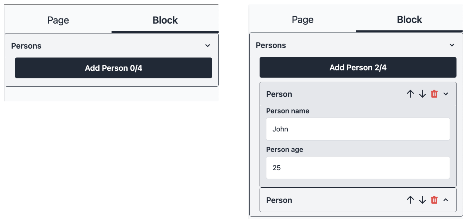
RepeatableField
Repeatable field edits props of array. RepeatableField will create an accordion with the array list inside.
When using slug inside RepeatableField fields, it will take the RepeatableField slug as root. Please look at the example
Type:
type RepeatableField = {
	type: 'repeatable'
	name: string // Name of an item of the array (ex: person)
	pluralName?: string // Name in plural form (ex: persons)
	slug: string // the name of the prop from the component
	max: number; // Array max size
	fields: SuncelField[]; // List of field, fields that the repeatble contain
	defaultValue?: any[];
	displayInSettings?: boolean;
}
Example :
interface MyComponentProps {
  persons: { name: string; age: number }[];
}

export const MyComponent: SuncelBlock<MyComponentProps> = () => {
  ...
};

MyComponent.suncel = {
 ...

  editor: {
    settings: [
      {
        type: "repeatable",
        slug: "persons",
        name: "Person",
        pluralName: "Persons",
        max: 4,
        fields: [
          {
            type: "text",
            slug: "name", // Root slug is persons so persons is skip
            name: "Person name",
          },
          {
            type: "number",
            slug: "age", // Root slug is persons so persons is skip
            name: "Person age",
          },
        ],
      },
    ],
  },
};
Admin page builder setting view:
KeyField
KeyField generates a unique Id in an array element. If you do not use a unique key in a dynamic array in React, a refresh issue can happen. It will cause an issue when updating the element order in the array.
As this field is for developer internal purposes, it is recommended to not display it on the page builder settings with displayInSettings:false
Type:
type KeyField = {
	type: 'key'
	name?: string // name is optional. Not meant to be displayed in the settings
	slug: string // the name of the component's prop
	defaultValue?: any[];
	displayInSettings?: boolean;
}
Example:
interface MyComponentProps {
  slug: string;
}

export const MyComponent: SuncelBlock<MyComponentProps> = () => {
  ...
};

MyComponent.suncel = {
 ...

  editor: {
    settings: [
      {
        type: "key",
        slug: "slug",
        displayInSettings: false
      },
    ],
  },
};
GroupField
GroupField is not used to edit props. It is used to group fields.
GroupField will create an accordion with the fields listed in the GroupField.
As GroupField has no effect on the editing, it has no slug.
Type:
type GroupField = {
	type: 'group'
	name: string // Name of the group
	fields: SuncelField[]; // List of field, fields that the Group contain
	displayInSettings?: boolean;
}
Example:
interface MyComponentProps {
	name: string;
	age: number
	address: {
		street: string
	}
}
export const MyComponent: SuncelBlock<MyComponentProps> = () => {
  ...
};

MyComponent.suncel = {
...

  editor: {
    settings: [
      {
        type: "group",
        name: "Person",
        fields: [
          {
            type: "text",
            slug: "name",
            name: "Person name",
          },
          {
            type: "number",
            slug: "age",
            name: "Person age",
          },
          {
            type: "text",
            slug: "address.street",
            name: "Person address street",
          },
        ],
      },
    ],
  },
};
Admin page builder setting view:
CustomField
Create your own settings documentation here ->