 Suncel v1.1
- Responsive
Builder > Responsive
Responsive
At Suncel, we made the choice to leave all the complexity of responsive for the developer.
Who takes care of the responsive?
The user in charge of the content edition does not have to perform any particular action to take care of the responsive. If they are well designed by the developer, the Blocks must be perfectly responsive.
Some Blocks may require special responsive features:
for example, on large screens, an image in horizontal direction will be displayed, while on a small screen, a more vertical image will be displayed, which requires two different images uploaded
another example, tables can be made invisible on a small screen, in favor of a different layout made of small successive blocks (Div replace the Table)
All this complexity related to the responsive is managed by the developer when designing the Blocks
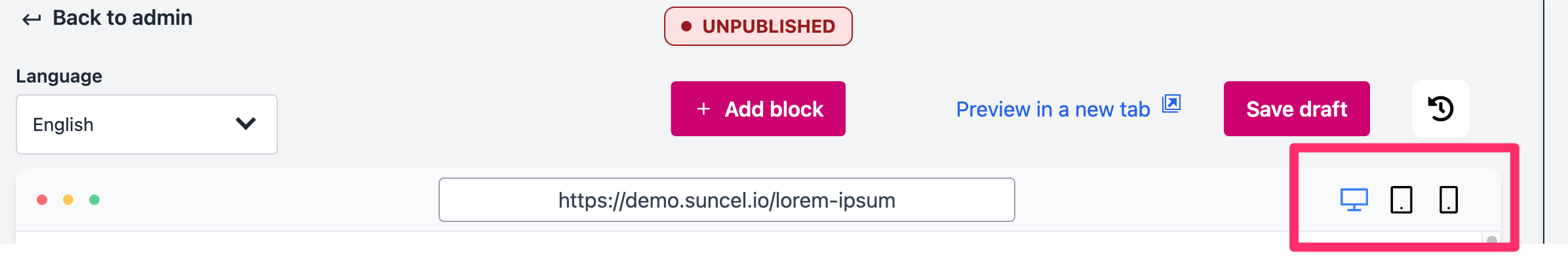
Change screen view
Thanks to the editor, you can have a live rendering on several different types of screens:
computer
tablet
smartphone
these are relatively standard sizes. You can also use the inspector of your browser to test other screen sizes (for this, use the Preview in a new Tab to avoid the side bar).
Example
Here is an example on with the same block in three different views :
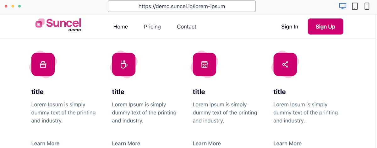
Large screen view (computer)
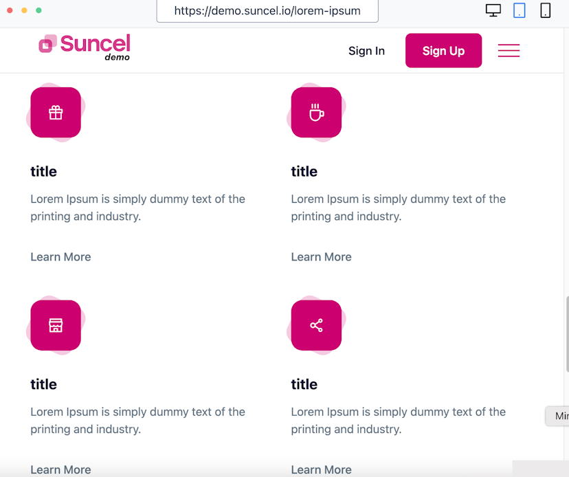
Medium screen view (tablet)
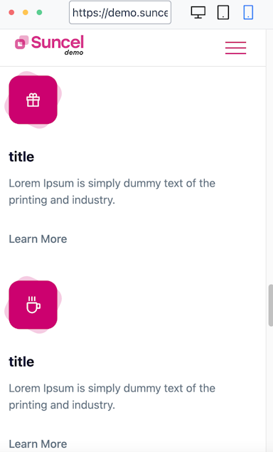
Small screen view (smartphone)